Should you have a Responsive Website?
If you've followed our blog for any length of time, you'll quickly see that we are big fans of responsive websites, and for good reason. Here we'll lay out the facts, and the difference between having a mobile website and having a responsive website - and tell you everything you need to know.
First of all, the biggest differences between having a responsive website and a mobile-website:
A. Your URL and HTML will not remain the same with a mobile website. This is huge. You don't want any confusion out there on which website is yours; you want all the attention focused on your main website URL.
B. A mobile website does not and cannot provide all of the information your website does. It's a completely different site. It's usually designed for just a quick glance and nothing more.
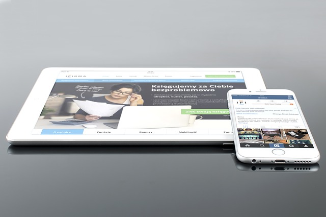
Now, on to the benefits of having a responsive website. Responsive means regardless of what device you're using: laptop, smartphone, desktop, or tablet - your website will automatically adjust and respond accordingly to ensure maximum user-friendliness. This prevents the dreaded pinching, zooming and turning just to read what your websites says. We have all been there, and you have likely just bounced out like we did.
So, if you want the same HTML code and URL, no matter where your customers are looking at your website, or from what device - a responsive website is the best way to go.
Finally, the last and one of the most-important reasons you need a responsive website? Google recommends it, and Google's new algorithm this month ensures a decrease in organic results if your website isn't easily understood, AKA responsive, on mobile devices.
Call today to see how we can help you, and for a free quote. 800-367-2570


Have your say
Feel free to take part in the discussion! Please be nice and do not include any abusive comments or spam. All comments are moderated and MAXtech Agency reserves the right to delete any comment.